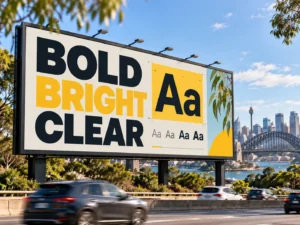
The best fonts for billboard advertising in Australia are usually bold, simple, and easy to recognise from a distance. Clean sans-serif typefaces such as Helvetica, Arial, Montserrat and Roboto can work well, but typeface selection is only one part of readability. Weight, spacing, letter size, contrast, message length, viewing distance and exposure time determine whether people can actually understand the advertisement.
Mobile formats introduce another variable: viewing time. A pedestrian looking at a stationary display has different reading conditions from a commuter passing a truck in traffic. Effective typography therefore starts with the real viewing environment rather than choosing a font because it looks attractive on a design screen.
What Makes a Good Billboard Font?
Effective billboard fonts make individual characters easy to recognise quickly and from a distance.
Simple letterforms reduce the amount of visual processing required. Letters such as O, C, G, I and L need enough distinction to remain recognisable when the advertisement is seen briefly or from across a road.
Five characteristics matter most.
- Clear letterforms: Characters need recognisable shapes without excessive decorative detail.
- Suitable weight: Strokes need enough thickness to remain visible without becoming so heavy that internal spaces close.
- Open counters: Spaces inside letters such as A, B, D, O and P need to remain clear at a distance.
- Comfortable spacing: Letters need enough separation to avoid merging visually.
- Simple proportions: Extremely narrow, stretched, or complicated characters can take longer to process.
Typeface choice therefore needs to support fast recognition rather than decorative complexity.
A brand can still use its own corporate typeface where that font remains clear under real outdoor viewing conditions. Brand consistency is useful, but readability takes priority when the campaign has only seconds to communicate.
The “Best Font” Can Still Fail at the Wrong Size
A clear typeface does not guarantee readability. Viewing distance, letter size, contrast, message length, and how quickly the audience passes the billboard all affect whether the text can actually be understood.
Best Fonts for Billboards
Several established typefaces work well because their shapes remain clear across different applications.
| Font | Why It Works | Best Use |
| Helvetica Bold | Neutral shapes, open forms, and strong readability | General campaigns |
| Arial Black | Heavy, simple letterforms with strong visual presence | Short headlines |
| Montserrat Bold/Black | Modern geometric structure with distinct characters | Brand and lifestyle campaigns |
| Roboto Bold/Black | Designed for clear screen rendering and digital interfaces | Digital displays |
| Futura Bold | Clean geometric construction with strong headline presence | Modern and minimalist campaigns |
| Verdana Bold | Wide proportions and generous spacing | Screen-heavy creative |
| Rockwell Bold | Distinctive slab-serif construction with substantial strokes | Short statement headlines |
1. Helvetica Bold for Billboard Advertising
Helvetica Bold is one of the most dependable choices for billboard headlines because its letterforms are clean, neutral and easy to recognise from a distance. The font uses relatively simple shapes, balanced proportions and substantial strokes, helping words retain their structure when viewers have only a short time to read them.
Helvetica Bold works particularly well for general brand campaigns, retail promotions, corporate advertising and short calls to action. Its neutral appearance also allows photography, logos and other visual elements to carry more of the brand personality.
The font still needs appropriate spacing and scale. Long sentences set tightly in Helvetica Bold can become difficult to process, particularly on mobile billboards where viewing distance changes quickly. Helvetica performs best when paired with concise copy, generous spacing, and strong contrast against the background.
2. Arial Black for Billboard Advertising
Arial Black provides strong visual weight and immediate presence, making it useful for short billboard headlines that need to stand out against busy outdoor environments. Its thick strokes remain visible from substantial viewing distances and can work effectively where the audience has only a few seconds to process the message.
The font suits promotional statements, sale messages, event dates and short calls to action. Arial Black also works well where typography needs to compete with photography or strong brand colours.
Its heavy construction requires restraint. Large blocks of Arial Black can feel visually dense, and tight spacing can cause letters to merge when viewed from a distance. The font performs best with short phrases, open spacing and ample negative space around the headline. Arial Black is therefore better suited to a few dominant words than lengthy supporting copy.
3. Montserrat Bold and Black for Billboard Advertising
Montserrat Bold and Montserrat Black combine geometric construction with a contemporary visual style, making them strong choices for modern billboard campaigns. Their substantial strokes and relatively clear character shapes can remain readable across digital and printed outdoor formats when sized appropriately.
Montserrat works particularly well for lifestyle brands, property campaigns, technology advertising, events, and contemporary retail creative. The typeface has more personality than neutral fonts such as Helvetica while still maintaining a clean structure.
Montserrat Black provides greater impact for very short headlines, while Montserrat Bold offers a slightly more open appearance for longer messages. Extremely tight tracking should be avoided because the geometric letterforms can begin to feel crowded. Billboard designers should also check characters at actual viewing distance, since some rounded forms can appear more similar when the text is reduced significantly.
4. Roboto Bold and Black for Billboard Advertising
Roboto Bold and Roboto Black are particularly useful for digital billboard advertising because the typeface was designed with screen readability in mind. Its letterforms combine clean geometric shapes with open proportions, allowing headlines and supporting text to remain relatively clear across different display sizes.
Roboto Bold works well for longer headlines, digital calls to action, and supporting information. Roboto Black provides greater visual weight where a short headline needs stronger emphasis.
The font is especially suitable for LED displays, digital mobile billboards and campaigns where creative may rotate throughout the day. Screen readability still depends on resolution, brightness, viewing distance, and background contrast. Thin Roboto weights should generally be avoided for large-scale outdoor viewing. Bold and Black weights provide stronger stroke definition, helping the text survive changing light, motion and street-level viewing conditions.
5. Futura Bold for Billboard Advertising
Futura Bold uses strong geometric forms that give billboard creative a distinctive, modern appearance. Its circular shapes, straight lines and simplified construction make it well suited to short headlines where visual personality matters alongside readability.
The font works particularly well for fashion, automotive, technology, architectural and design-focused campaigns. Futura can also support minimalist billboard layouts because its character shapes create a strong visual identity without requiring additional decorative elements.
Futura Bold performs best with concise wording. Some characters have unusual geometric proportions compared with more neutral sans-serif fonts, so longer phrases can require slightly more reading effort. Generous spacing improves recognition, particularly when the advertisement is viewed quickly from traffic. Designers should also avoid relying on lighter Futura weights for outdoor headlines because thinner strokes can lose definition at distance or against bright backgrounds.
6. Verdana Bold for Billboard Advertising
Verdana Bold was designed for screen legibility and uses wide characters, generous spacing, and large internal openings. Those characteristics can make it effective for billboard creative where fast recognition matters, particularly on digital displays.
The wider proportions give individual characters more separation, which can help when the audience is viewing the advertisement from an angle or from a substantial distance. Verdana Bold can work well for informational messages, event advertising, digital screens and campaigns requiring highly functional typography.
The main trade-off is space. Verdana occupies more horizontal room than condensed or narrower typefaces, meaning long headlines can quickly consume the available billboard area. That limitation can actually encourage stronger outdoor copy because designers are forced to keep the message short. Verdana works best when the campaign prioritises straightforward readability over a highly distinctive typographic personality.
7. Rockwell Bold for Billboard Advertising
Rockwell Bold shows that serif fonts can work effectively on billboards when the letterforms are substantial and uncomplicated. Rockwell uses heavy slab serifs rather than thin decorative strokes, giving each character a strong structural outline that can remain recognisable at a distance.
The font is useful for short statement headlines, heritage-inspired campaigns, hospitality brands, events and creative concepts that need more typographic personality than a conventional sans-serif provides.
Rockwell Bold requires careful spacing because its slab serifs add visual mass around each character. Crowded words or long sentences can quickly become dense, particularly when displayed over photography. Short headlines with generous breathing room allow its distinctive structure to work more effectively.
Rockwell should be treated as a deliberate design choice rather than a default billboard font. It performs best when the creative concept benefits from its strong, characterful appearance.
Impact for Billboard Advertising
Impact is designed to attract attention through very heavy strokes and condensed letterforms. That construction can make it effective for extremely short billboard headlines where only a few words need to dominate the design.
Impact can work for promotional statements, event messaging, and bold campaign concepts where visual force matters. Its narrow characters also allow relatively large lettering to fit within limited horizontal space.
The same characteristics create its main limitation. Condensed letters and tight default spacing can make longer phrases difficult to process quickly, especially when viewers are moving. Dense blocks of Impact can also lose distinction between individual characters at distance.
Impact therefore works best for short, high-contrast statements rather than detailed information. Designers using it should increase spacing where necessary, keep the wording minimal, and test the finished creative under realistic viewing conditions before launch.
These are useful starting points rather than universal winners.
The best fonts for billboards are the fonts that remain understandable in the final creative under actual campaign conditions. Helvetica can perform poorly when set too small. Montserrat can become difficult to process when excessively condensed. Rockwell can lose clarity when multiple lines are packed tightly together.
Typography needs to be assessed as part of the complete advertisement.
Are Sans-Serif Fonts Always Best?
Sans-serif fonts are generally the safest option when a billboard needs fast readability, but serif typefaces are not automatically unsuitable.
Sans-serif fonts remove the small finishing strokes found on traditional serif characters. Cleaner outlines can make letters easier to recognise at speed, particularly in short outdoor headlines.
A simple, substantial serif or slab-serif font can also work. Rockwell is one example because its serifs are heavy and structurally clear rather than delicate.
The greater problems are highly decorative scripts, very thin serif fonts, elaborate display faces, and typefaces containing unusual character forms.
A billboard does not need to look typographically plain. It needs a hierarchy that allows the main message to be understood before decorative personality begins competing for attention.
How Large Should Billboard Text Be?
The correct billboard font size depends on viewing distance, display dimensions, resolution, traffic conditions, and how long the advertisement remains visible.
One universal point size cannot describe every billboard.
A pedestrian-facing walking board can be viewed at a relatively short distance and slower speed. A large roadside format may need to communicate from much farther away. A mobile truck can move between those conditions during the same campaign.
Digital display resolution also influences how characters render. MMA’s mobile digital billboard truck uses a different display environment from a printed traditional billboard, so typography needs to be judged on the actual medium.
Headline text should dominate the visual hierarchy and remain understandable from the intended viewing position. Secondary text needs enough size to survive the same environment rather than becoming readable only when someone stands directly beside the billboard.
Testing is more reliable than choosing a number from a generic design rule.
Related: What Is a Mobile Digital Billboard Truck?
Font Weight, Width and Spacing Matter
Letter weight, width, and spacing can change readability even when the typeface itself is appropriate.
Very thin text can disappear against bright backgrounds or become difficult to distinguish from surrounding imagery. Excessively heavy text creates the opposite problem. Internal spaces can close, and neighbouring characters can visually merge.
Extremely condensed fonts allow more words into a smaller area, but fitting more copy onto a billboard is not necessarily an improvement. Narrow characters require greater visual discrimination, particularly when the audience is moving.
Tight tracking creates another problem. Letters that appear elegant on a laptop can become a continuous block when seen from a distance.
The objective is not to select the heaviest possible font. The objective is fast character recognition.
A useful typography hierarchy typically gives the headline the greatest weight and scale, keeps supporting text visually secondary, and gives the call to action enough separation to remain identifiable.
Why Mobile Billboards Need Faster-Reading Typography
Mobile billboards create a more variable reading environment than many fixed advertising formats.
The truck can be moving. The viewer can be moving. Both can be moving at the same time. Viewing distance can also change within seconds.
A person standing near an event precinct may have time to examine a digital mobile billboard. A motorist seeing the same creative during traffic movement has a much shorter and less predictable viewing opportunity.
Typography therefore needs to survive several conditions:
- changing viewing distance;
- changing angles;
- surrounding traffic;
- pedestrian movement;
- bright daylight;
- changing backgrounds and streetscapes;
- brief exposure windows.
Strong mobile billboard route planning also affects how typography is experienced. Routes with slower movement or useful dwell opportunities can give audiences more time, while faster roads demand even greater simplicity.
Typography and route strategy are separate disciplines, but the viewing environment connects them.
Related: What Is a Mobile Digital Billboard Truck?
Related: How to Choose Routes for Mobile Billboard Advertising Campaign
Related: Is Billboard Advertising Effective?
Design for the Real Viewing Environment
Do not approve typography only because it looks readable on a laptop. A mobile billboard may be viewed from across a road, through traffic, in bright daylight, or for only a few seconds. Test the finished design under realistic conditions before launch.
Contrast Can Matter as Much as the Font
Strong billboard design gives text enough contrast and visual separation to be recognised immediately.
A highly legible typeface can become difficult to read when it sits over detailed photography, similar colours, or bright visual elements.
Light text on a sufficiently dark background can create strong separation. Dark text can work equally well against a light background. The important attribute is contrast between the characters and the area immediately behind them.
Photography needs particular care. Placing a headline over faces, buildings, crowds, or highly textured imagery can introduce visual noise that disrupts the outline of the letters.
Clear space gives typography room to work.
The headline, image, logo, and call to action should each occupy a deliberate part of the hierarchy rather than competing for the same visual area.
A stronger design makes the reading order obvious: message first, brand identification next, action last.
Related: Static vs Digital Billboard
Related: Different Types of Mobile Billboard Advertising
How Many Words Should a Billboard Use?
Billboard copy should contain as few words as the viewing environment allows while still communicating the intended message.
A fixed rule such as “every billboard must contain 5 to 7 words” ignores substantial differences between formats.
A pedestrian viewing a walking board outside an event can process more information than a person seeing a roadside mobile billboard for several seconds. A strategically positioned campaign in a shopping area can support a slightly longer message than creative designed primarily for moving traffic.
The better question is whether the audience can read and understand the complete primary message during the realistic viewing window.
Additional copy creates extra reading time. Extra reading time increases the risk that the viewer reaches the end of the exposure before reaching the important information.
Billboard copy therefore works best when every word has a clear job.
Fonts for Digital Billboard Advertising
Typography for digital billboard advertising needs to remain clear across LED rendering, different lighting conditions, and changing creative.
Digital displays are constructed from pixels rather than printed ink. Very fine strokes and small text can therefore lose definition depending on pixel density, viewing distance and screen configuration.
Bold fonts with clean shapes generally render more consistently from a distance. Roboto Bold, Helvetica Bold, Arial Black and Montserrat Bold are strong starting points because their major character features remain visually prominent.
Motion also changes the typography decision.
A message that appears briefly within an animated sequence needs faster recognition than a static digital frame displayed for longer. Rapid transitions, moving backgrounds and animated text can reduce comprehension when several effects compete at once.
Digital capability should therefore increase creative flexibility rather than information density.
MMA’s digital mobile billboards use 20m² of P4 LED screen space across three sides, which allows multiple creative executions while still requiring each individual message to remain clear at street level.
How to Test Billboard Fonts Before Launch
Billboard typography should be tested as finished creative rather than evaluated as an isolated font sample.
A practical test uses 7 checks:
- View the complete artwork rather than the headline alone.
- Reduce the design substantially on screen to simulate distance.
- Step away from the monitor and check whether the headline remains understandable.
- Display the advertisement for only a few seconds, then record what you remember.
- Test the creative on the intended screen or physical format where possible.
- Review visibility under daylight and lower-light conditions relevant to the campaign.
- Ask someone unfamiliar with the creative to describe the message after a brief viewing.
The final test is especially valuable because designers already know what the advertisement says. Familiarity can make difficult copy feel easier to read than it actually is.
Testing also strengthens billboard advertising effectiveness because visibility has limited value when audiences cannot process the message during the available exposure.
Related: Is Billboard Advertising Effective?
Common Billboard Font Mistakes
Typography problems tend to come from execution rather than a single “bad” font.
Common mistakes include decorative scripts used for primary headlines, overly thin fonts, extremely condensed type, several competing typefaces, weak colour contrast, excessive copy, undersized call-to-action text, and tight letter spacing.
Using several fonts can also fragment the hierarchy. One type family with different weights can often provide enough distinction between headline, supporting text, and CTA.
Small text creates a particularly serious problem because information may technically appear in the artwork while remaining functionally unreadable in the real environment.
A billboard is not successful because every available area has been filled. Negative space can make the important information easier to recognise.
Best Fonts for Billboard Advertising in Australia: Does Location Change the Choice?
The basic principles behind the best fonts for billboard advertising in Australia remain consistent across cities, but the viewing environment can change substantially.
Sydney CBD campaigns can encounter dense traffic, surrounding signage and varied street geometry. Melbourne campaigns can move between CBD streets, retail precincts and event areas. Brisbane campaigns can operate across bright outdoor environments, suburban corridors and entertainment precincts.
The font itself does not need to change simply because the campaign moves between Sydney, Melbourne or Brisbane. The application of the typography may need to change because viewing distance, audience movement, display brightness and surrounding visual competition differ.
Australian campaigns therefore benefit from testing typography against the actual route and display rather than approving one design solely from a desktop preview.
Frequently Asked Questions
What Are the Best Fonts for Billboards?
The best fonts for billboards are clear, substantial and quickly recognisable. Helvetica Bold, Arial Black, Montserrat Bold, Roboto Bold, Futura Bold, Verdana Bold and Rockwell Bold are useful options, provided the final size, spacing and contrast suit the viewing environment.
What Billboard Font Size Should I Use?
The right billboard font size depends on viewing distance, physical display dimensions, audience speed, screen resolution, and exposure time. Test the complete design at realistic viewing distances rather than relying on one universal size.
Are Sans-Serif Fonts Best for Billboards?
Sans-serif fonts are generally a reliable choice because their clean letterforms support quick recognition. Serif fonts can also work when their shapes are simple, substantial, and clearly spaced.
Can Serif Fonts Be Used on Billboards?
Yes. A bold slab-serif typeface such as Rockwell can work for short headlines. Thin or intricate serif fonts become harder to process at a distance.
Is Impact a Good Billboard Font?
Impact can provide strong headline visibility because of its heavy condensed construction, but its narrow spacing can reduce readability when copy becomes long. It works better for very short messages than multi-line text.
What Font Works Best for Digital Billboards?
Clean bold fonts such as Roboto Bold, Helvetica Bold, and Montserrat Bold can perform well in digital billboard advertising because substantial strokes tend to render clearly across varying distances and lighting conditions.
How Many Fonts Should One Billboard Use?
One or two type families are sufficient for most campaigns. Different weights within one family can create hierarchy without introducing unnecessary visual competition.
How Do You Test Billboard Readability?
Test the final creative at reduced scale, from greater viewing distance, during short exposure periods, and on the intended display where possible. Ask someone unfamiliar with the campaign to identify the main message after seeing it briefly.
Make Every Second of Viewing Time Count
Typography determines how quickly an audience can turn billboard visibility into understanding. Strong fonts help, but readability comes from the complete combination of size, weight, spacing, contrast, copy length, and the real environment in which the message appears.
Mobile Marketing Australia builds campaigns for changing Australian viewing conditions, from commuter corridors to shopping and event precincts.
Explore Digital Mobile Billboards when your campaign needs large-format digital creative that moves with the audience.